Useful resources:
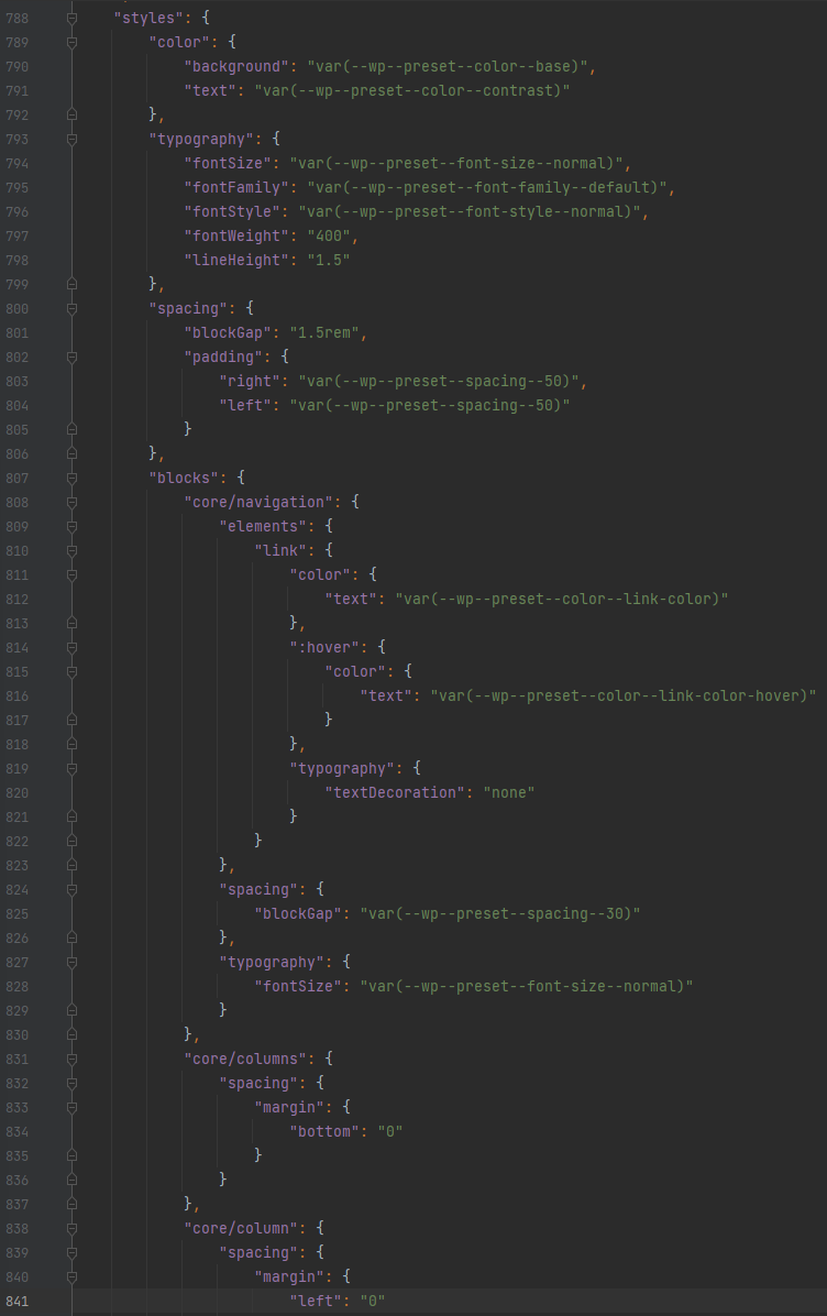
Review of the theme.json elements
See this Google Sheet for an easy reference to Rubrum theme.json defaults >>
Layout
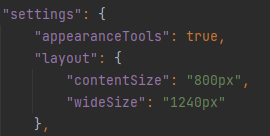
contentSize = Content width for blog posts.
wideSize = Site container width.
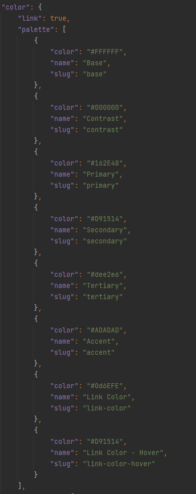
Color Palette
Setup the color palette based on design colors.
Base = Primary background color (usually white)
Contrast = Primary text color (usually black)
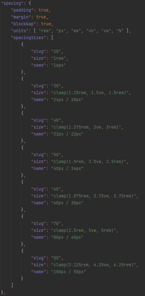
Spacing
Used to set the margin/padding of various blocks, most commonly for setting vertical and/or horizontal padding on Group blocks.
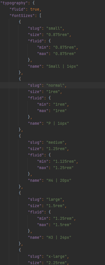
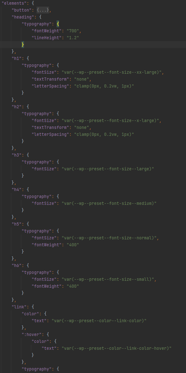
Typography
Font Sizes
Fluid = true
Enables custom font sizes to also be responsive (mobile friendly).
“size” and “max” = largest desktop font size.
“min” = smallest mobile font size.
It automatically handles the responsiveness between the largest and smallest sizes.
slug names match WordPress defaults (small, medium, large, x-large, xx-large).
Assign font sizes and other attributes to H1, H2, H3, etc..
Font Families
Define which fonts are available. Typically at least a heading font and the default font.

The fonts will be available in the Typography Font Family drop-down in various Blocks and get assigned a class that is also available to use. For example:
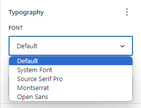
.has-default-font-family
.has-heading-font-family
.has-source-serif-pro-font-family
Font URL
Get the font URL from Google Fonts. Determine which fonts and font-weights are needed based on the site design.


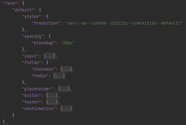
Forms
Set styling for the form fields and button.
Buttons
Set styling for the primary, secondary, and accent buttons.

The button styling is in different locations in the theme.json because we’ve added custom styling options that apply to Bootstrap button variations, the other button styling applies to default WordPress buttons.

This is how all of the button options look by default:
Other Stuff
There are settings for:
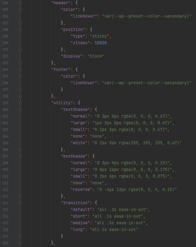
- Header and Footer link hover colors. (maybe we don’t need these here anymore, now that Gutenberg has better link hover color settings?)
- Enable or disable sticky Header (change “sticky” to “relative” to disable the stickiness).
- Defaults for text shadow, box shadow, and transitions.
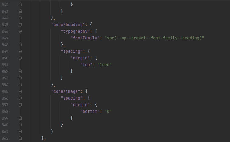
More Other Stuff
Other than maybe changing the default typography line-height, you won’t typically have to touch most of these additional style settings, but these help to ensure that various WordPress elements/blocks use the styles we’ve defined throughout theme.json.
Styles — spacing — blockGap – used as the default gap/margin for some blocks like the Group and Column blocks.
Styles — spacing — padding – used for the global left/right padding settings. Helps to keep consistent left/right padding on the site, especially for mobile.
You can also set some of the navigation styles, such as font details, colors, and the gap between links.
That’s all for now!